Visualizer
Overview
ColorTokens XShield Visualizer is a powerful, graph-based analytics tool that delivers deep visibility into network traffic flows across organizational assets. It enables security and operations teams to visualize and analyze the impact of traffic flows and Zero Trust policies, supporting the confident design and enforcement of microsegmentation strategies.
The Visualizer provides a consolidated view of business applications through dynamic visibility maps, including historical traffic flow analysis and an actionable interface to explore every aspect of the discovered environment. With support for over 15 contextual dimensions—such as location, application, environment, and asset type—the Visualizer is tailored to meet the needs of diverse user personas across the enterprise
Data Collection & Integration
XShield Visualizer collects network flow data from multiple sources:
- Agents installed on customer-managed servers, endpoints, and devices.
- Gatekeeper installed on customer-premises or data center (DC) for OT and server environments.
- Agentless integrations with Endpoint Detection and Response (EDR) platforms such as CrowdStrike, Microsoft Defender and SentinelOne.
These sources ensure continuous ingestion of traffic data, supporting both real-time insights and historical analysis across your infrastructure.
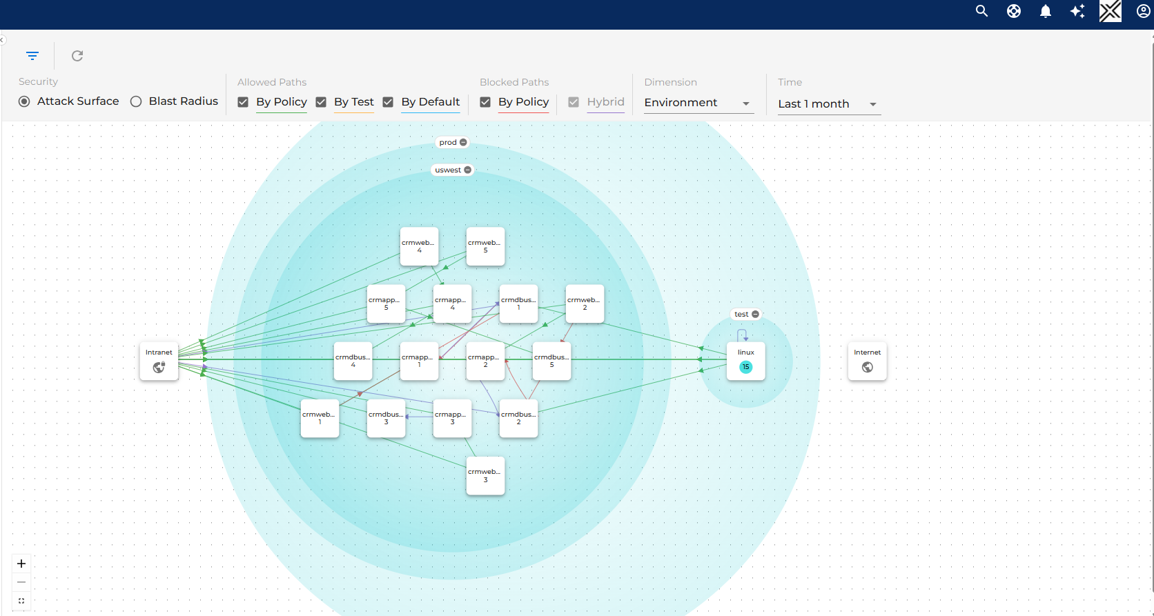
Graph Layout & Asset Grouping
Traffic flows in the Visualizer are organized into four primary groups:
- Selected Assets – The primary focus area, defined by filters such as application, environment, or business unit.
- Internet – Captures all traffic to and from the public internet.
- Intranet – Represents traffic to/from unmanaged internal assets.
- Intranet can be expanded into Named Networks, allowing logical grouping of specific internal zones like partner networks or shared services.
- Managed Assets – Shows flows involving managed assets not included in the current selection.
Dynamic Grouping Dimensions
Assets can be grouped and explored by over 15 dimensions, including:
- Application
- Environment
- Location
- Custom Tags (user-defined)
- Subnets
Each node contains a “+” icon to expand into another dimension or isolate traffic for detailed analysis.
Traffic Visualization: Inbound & Outbound
The Visualizer provides two directional views:
- Attack Surface – Visualizes inbound traffic to selected assets, highlighting potential exposure risks.
- Blast Radius – Visualizes outbound traffic from selected assets, useful for evaluating lateral movement or data exfiltration risks.
Users can toggle between these modes to explore network behavior from different perspectives.
Traffic Filtering Options
Traffic is categorized into Allowed and Blocked types, with filtering controls available via checkboxes:
Allowed Traffic
- By Policy – Allowed by defined segmentation rules.
- By Test – Temporarily allowed due to assets being in Test mode.
- By Default – Allowed because the assets are in Unsecure mode (no policy applied).
Blocked Traffic
- By Policy – Blocked by deny rules or due to absence of allow rules when in Enforced mode.
- Hybrid – Flows that exhibit mixed behavior and don’t clearly fit into allowed or blocked categories. (Can be optionally hidden.)
These filters extend to all traffic types, including those within Named Networks.
Time Filtering
Users can refine traffic views using adjustable time ranges:
- 1 hour
- 6 hours
- 1 day
- 1 week
- 2 weeks
- 1 month
Time-based filtering helps identify short-term anomalies, confirm recent changes, and track evolving patterns.
Interactive Exploration
The interface supports rich, hands-on exploration:
- Clicking traffic lines reveals protocol details, source/destination, ports, and matched policy rules.
- Zero In on nodes by expanding based on tags or grouping dimensions (e.g., application, location, Named Networks).
- Toolbar filters enable precision targeting of assets and flows; search (if available) helps locate specific nodes or tags quickly.
Policy Simulation & Deployment Window
Selecting a node or asset group opens the Deployment Window, which enables:
Enforcement Simulation
- Users can drag the slider to simulate policy impact across states:
Unsecure → Test → Enforce - This previews how traffic behavior would change under each policy condition.
Live Deployment
- Users can promote selected assets into the desired enforcement state from the same panel.
- This feature bridges the gap between planning and actual Zero Trust policy enforcement, streamlining operational workflows.
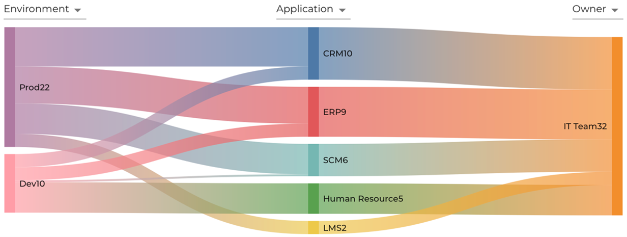
Sankey Chart
The Sankey Chart in the XShield Security Platform is designed to visually represent the flow and relationships between different tag categories. It supports three distinct dimensions, enabling users to intuitively explore how entities are interconnected across the environment. This visualization aids in understanding complex data relationships, making it easier to analyze traffic patterns, policy impacts, and asset groupings within the platform.